Random Walk in Colour Space  

An Experimental Art Project

This is a project which has engaged me occasionally since 2002.

Colour space is essentially three-dimensional, as is our ordinary physical space of solid objects.  A colour spot can move around in colour space in the same way as an object can move in ordinary space. There is directions “up” and “down” corresponding to “bright” and “dark”.

In any picture, consisting of a number of uniformly coloured areas, you can make the colours vary continuously by letting them walk around in colour space and study the perceptual and emotional effects of the resulting colour compositions.

As concerns form, there should be no spatial changes. Any perceived movement is thus due to changing brightness and hue of colour areas, as well as changing contrasts between adjacent areas. For instance, an area that gets brighter may seem to grow bigger and advance towards you.


How it started

Let me shortly tell how I originally got the idea to this study. In 1975 I visited the Swedish painter Olle Baertling in his atelier. He asked me if I could figure out why the particular choice of colours, in his abstract paintings, was so essential for the specific impact of these. In principle this could be studied by varying the colour values and judge the aesthetic effect. But I didn’t at that time have adequate resources for that.

Much later, in connection with a study of defective colour vision (in 1994-95), I developed a computer program for deliberately varying the colours in any simple grahically well-defined picture. I also used it to develop an interactive program, with the help of which you can aquaint yourself with various colour perception phenomena, such as simultaneous contrast, afterimages and the like.   

In december 2002, together with some artist friends, I visited Tate Gallery in London to see the big exhibition of Barnet Newman paintings. Back home, I made a computer simulation of a “quasi Newman” painting, with four fields, the colours of which could be arbitrarily varied.  But how? The possibilities for choosing colours are enormous. Then I got the idea to let them vary arbitrarily, automatically exploring the available colour space on the computer screen by a stochastic procedure.  


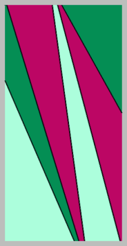
 Next, I tried the same with a “quasi-Baertling” picture.  (One of these that Baertling himself had once asked me to study, see below.)  Of course, I could not prove or make plausible why the particular “Baertling colours”  were necessarily the best choice, but I saw the enormous number of choises that were apparently bad.  So the mystery remains how a painter succeeds in choosing the appropriate colours for his painting.


However, the astonishingly strong aesthetic and emotional impact that the continuously varying colours were capable of giving a beholder made me tempted to follow this up.  So instead of alluding to existing art works I designed a number of graphically simple and plain pictures, to be used together with more sophisticated programs for the stochastic procedure of colour change (described below).


VERTICAL  COMPOSITIONS

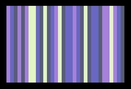
These are standing bars, adjacent or as pillars on a scene against some background.

Typically, there could be 4 independently changing colours, distributed on 28 bars. To have more independently varying colours than 3 or 4  turned out to be uninteresting, due the the rapid rise of number of possible combinations.  It is more rewarding that the same colour, and consequently a simultaneous change, appears at several places along the pattern.


This work was shown at “Moviken Art 2003” – an exhibition, together with nine other artists, installed in an old industrial building in Moviken, northwest of Hudiksvall, Sweden. The continuously changing picture was back-projected onto a white screen (Rosco Twin White) that measured 260 x 180 cm.  

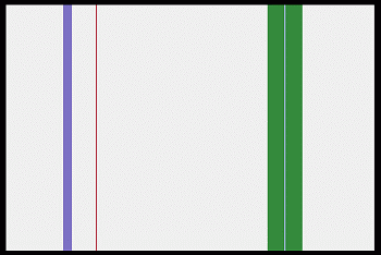
Later on I tried a number of variants with spaced bars against some arbitrary static background, as e.g. this:  


So far strictly vertical designs, inspired by the Newman paintings. How about horisontally stratified designs?


HORISONTAL  COMPOSITIONS

If the fields are arranged horisontally, the association with the idea of  a landscape view seems almost unavoidable.  Even a picture like the following one is easily interpreted as sea, shore, distant mountains and heaven.  The stochastically and independently changing colours of the 4 areas make the impression of light variations over the scenery, bringing with it various moods.    


Landscapes

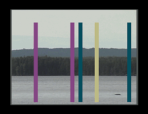
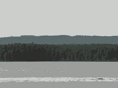
One may, as well, start from a similar photographic image.    I have chosen to work with this still view.  (Lake Norrbränningen, near Söderhamn, Sweden)  


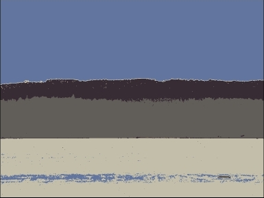
The number of colours were reduced to 32 (or 16 or even less) and among these four  colours were carefully selected for random walk in the RGB colour space. I usually let them start from a grey scale, in time resulting in a picture with casual colour combinations – some ugly and meaningless, some astonishingly beautiful and with strong emotional impact. The process continuously passes on, without ever repeating itself, since the number of possible colour combinations is practically infinitely great (1020 ).   The following picture illustrates how it can look. (See also the youtube clip, below!)  


Principles

My aesthetic intention is that the changes shall proceed so slowly and in such small steps that you will not notice the colour change, until you suddenly find it has happened. (Like how the sun or moon moves on the sky.) It is a wonderful contemplative experience!

Don’t expect anything else to happen. It is all about colour, and nothing but colour. Any experience of movement is due to the changing colours, making up the picture. The silent flow of time – colour as music.

Moreover, due to that fact that we ordinarily perceive object colours as constant despite varying illumination conditions,  the experience will, as far as perceptually possibe, be that of a changing illumination of the scenery. Even if the three or four colours vary independently of each other.

Demos

The following short video demos of the art-works are based on screenshots from authentic runs of the program. Please take care to look at them full screen – the bigger the better!

(If you look at a small screen, e.g. on a mobile phone, you essentially use the fovea centralis, which is intellectual, good for reading text and identifying signs and objects. You need a fuller, more extensive retinal stimulation, to experience the emotional impact of colours.)

Randomwalk

Norrbränningen

Forest in disguise

För svenska läsare, se vidare på   hemsidan


Looking behind the scene

You get a short introduction in the animated demo found here  

In a given simple picture you can select some areas, having the same colour, and let this colour vary, by stochastically changing the three parameters controlling its value (r,g,b).

On a computer screen the colour space is realized as the so called RGB-space.  The three independent “directions” of this space is defined by the primary colours R (red), G (green) and B (blue).  In practice it is limited to the volume of a cube, since each of the three “coordinates” for any colour position in the space varies between 0 and a given maximal excitation, let us put it to 1.   So when all three are at max, that is (1,1,1) this is the white point, the colour value of highest luminace. Any colour position in the colour-cube, defined by coordinates (r,g,b)  is darker than white and more or less chromatic. The grey scale spans diagonally, between (0,0,0) and (1,1,1).

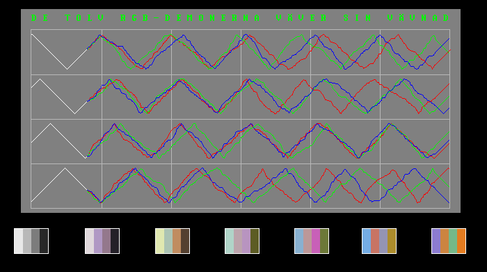
The following diagram shows an example where 4 colours start from 4 grey values and periodically shift between a lowest and a higest value. At a certain moment we introduce a stocastic element in the choice of which of the 12 parameters should change next, resulting in arbitrary phase-shifts between them, in turn resulting in a bursts of colour variations.  


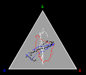
Next picture shows the random walk in a so called "Maxwell plot". In this diagram white, black and all greys are at the center and chromatic colours spread out over the surface of the triangle. (The red, blue, black and white dots denote the four varying colours.)  As you see, sometimes a colour shifts between complementary hues, at other times it wanders through a hue circle, as is the case with the one marked red in the diagram.   


Finally

Don't forget that all this concerns technical matters.  The essential thing is the experience you may have, standing in front of the resulting picture with its slowly varying colour values, giving a never ending display of spectacular colour combinations.  

För svenska läsare, se vidare på   hemsidan

PSColour\randomwalk.htm   2014-11-18